Friday, October 26, 2007
Guess Who the Big Guy Is?

This is a great ad by Hyundai. It is visually captivating and compliments the copy. The copy reads:
Think About It
Two Warranties Enter the Ring, One Warranty Leaves.
It’s gonna be long night for one of these warranties. Guess which one:
In this corner, the typical 5-year/60,000 mile powertrain warranty from the typical car company. In the other corner, Hyundai’s towering 10-year/100,000-mile powertrain coverage—more than BMW, Honda, or Toyota.
We wouldn’t offer this kind of coverage if our cars didn’t keep humming year after year. Yelps would go in our financial depart-
Continued at ThinkAboutIt.com
The use of the word towering is a strong connection to the image. I love the use of the word humming to describe the fact that the cars last a long time. The ending of the text in the middle is also a good way to drive the reader to the website for more information.
Thursday, October 25, 2007
Mugshot Covers

I was looking through my magazine collection. When I noticed these two magazines. They both are using the same type of image (MUGSHOT) and similar color palettes but they are both different.
The Men’s Journal magazine does not feel welcoming at all. The photo of Steve Nash looks dry and empty. Even though the article is about him bringing fun back to the NBA. He doesn’t look very fun to me. He looks like an animation. There is a disconnect between the cover line (Steve Nash The Superstar Who Made The NBA Fun Again) and the image. The fonts take over the page. Everything is in bold which is overpowering. Note: I hate Rooflines! (I hate them so much I think it is worth wasting one of my five “!”)
The Details magazine feels lighter and cleaner. The cropping and the off center positioning helps the cover. Ben Affleck’s expression looks like a man that is determined and focused which goes well with the cover line. I love the use of bold, regular and lightface fonts to show hierarchy. The fonts don’t takeover the page as the Men’s Journal cover does. The lighting is also well done. The lighting does not make Ben Affleck look dark or evil. The lighting can change the effect of an image like this. The Men’s Journal cover is a perfect example of this. The shadow on the left hand side gives Steve Nash a dark mysterious look. This look would be OK if the cover line read “The Dark Side of Steve Nash.”
If you are going to use an image like this on your cover you have to really think about what this type of image says to your reader. The image, typography and lighting can make or break a cover.
Friday, October 19, 2007
COLORS

As a designer I love the changing of the seasons. This time of year I would have to say is my favorite. The color pallets that the trees have are amazing. The oranges, reds, greens, and yellows inspire me everyday on my long commute from Bowie to Gaithersburg. The colors for this time of year are bright and vive rant. It always fascinates me that as the sun go down the effects of the colors and the mood of the trees change as well.
Mother nature gives us this amazing display of colors and a lot of us take it for granted. Next time you get a chance look up and take in all the amazing colors.
Friday, October 12, 2007
Washington Post Commercial
There is a Washington Post commercial that is airing on TV that sums up the life of a designer in the world. The commercial shows a designer working on a project with someone behind him telling him how to lay a project out. The person behind the designer is tell what colors to use and is not allowing the designer to get a word in edge wise. Then their shadows appear in the background. The shadow is a ringmaster making a dog jump through a hoop.
As designers we all have had this feeling. I LOVE THIS COMMERCIAL!
As designers we all have had this feeling. I LOVE THIS COMMERCIAL!
Friday, October 5, 2007
Clover Lines

I was scanning the newsstand the other day and saw this cover of Detail magazine. As I looked at the cover lines from the newsstand they read as the following: Are you satisfying your wife, the new White-collar addiction, and the army's big gay secret. Are they telling me Brad Pitt can satisfy my wife, is he the new addiction, or is he the Army's big gay secret? The cover line that had something to do with Brad Pitt was on the bottom of the cover.
The placement of cover lines are important to magazines on the newsstands. If the main cover line is on the bottom of the cover it is most likely covered. Details probably thought his image would be enough. But as a reader I want to know what the article is about.
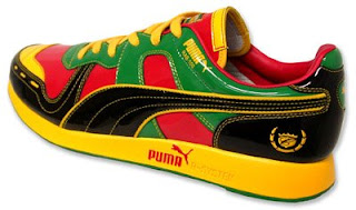
Sneakers

As I was working on my classification project. I ran across a lot of shoes that have interesting designs. Sneakers have come a long way from those off white Chuck Taylor’s All-Stars of the 20’s. Sneakers have some good and bad color palettes. Our sneakers can say a lot about us. What do you look for in a sneaker? Is it the design/style, comfort, or price?
Subscribe to:
Posts (Atom)